![iPost-GRADIENT-1.png]](https://help.ipost.com/hs-fs/hubfs/iPost-GRADIENT-1.png?width=100&height=43&name=iPost-GRADIENT-1.png)
Create a Drag & Drop Email
- Click on Emails on the left-side menu.
- Email email name in the Create New Email field.
- Select Drag & Drop Email from the Content Type drop down menu.
- Click Create.
- Select a prebuilt layout from one of the five available options:
- Blank
- One column
- Standard
- Newsletter
- E-commerce
- Click Continue to move to the Properties step.
- Fill out the required Properties fields and any optional fields.
- Click Continue to move to the Content step.
- Drag rows and content blocks from the editor to your workspace to build your creative.
- To save your progress, click on Save. This will allow you to leave the email without losing any work. The email with remain in the Draft status when saved.
- To validate your email's content and update the status to Ready, click Continue to move to the Preview tab.
iPost requires that all emails pass the validation process prior to being mailed and will not send any emails with a Draft or Error status.
Drag & Drop Editor Workspace
The workspace is separated into three sections:
- Settings: apply general customization options to the entire email.
- Rows: store multiple types of content within a single section of an email.
- Content: the building blocks of your email.
Settings
The Settings tab in the editor provides a centralized location for setting up configurations that apply across your entire design (expect where a custom setting is applied to a row). This is very useful to help build a coherent message very quickly.
- Content area width: Sets the maximum width of the content area on larger screens. It is ignored on smaller devices.
- Content area alignment: Define the default alignment for content areas. This is set to Center, by default.
- Background color: The default background color for the message. This can be overridden at the row, column, and content block level when setting properties for those elements.
- Content area background color: The default background color for the content area. This can be overridden at the content block level.
- Background image: Set a background image for the entire email.
- Default font: The default font family that all content elements in the message will inherit. This can be overridden at the content block level.
- Link color: The default link color that all links will inherit. This can be overridden at the content block level.
Background image support varies across email clients. A fallback content area background color should be chosen for optional results.
There are two optional properties, under Metadata, that can be configured.
- Title: Sets the title in the HTML code.
- Language: Use this setting to declare an HTML language attribute within the email.
Rows
Rows organize content blocks and define the horizontal composition of a section in the email. Each row has its own setting and can be customized to fit your content needs.
The following options are available for each row:
Row background color
Set the background color for the entire row.
Content area background color
Specify the background color for just the content area within the row.
Row background image
Add a background image to your row or content area. NOTE: Background image support varies across email clients. Choose a fallback background color for optimal results.
Content area borders
Set a border around the content area with customizable color, width, and style.
Content area rounded corners
Add rounded corners to the content area.
Vertical align
Choose the vertical alignment for the content block(s) within the row.
Stack on mobile
Off - prevents the content within the row from stacking vertically on mobile devices
On - allows the content blocks to stack vertically on mobile devices
Stack order on mobile
Define stacking order of content blocks if Stack on mobile is turned on. Below shows stacking order options on mobile devices.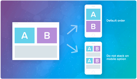
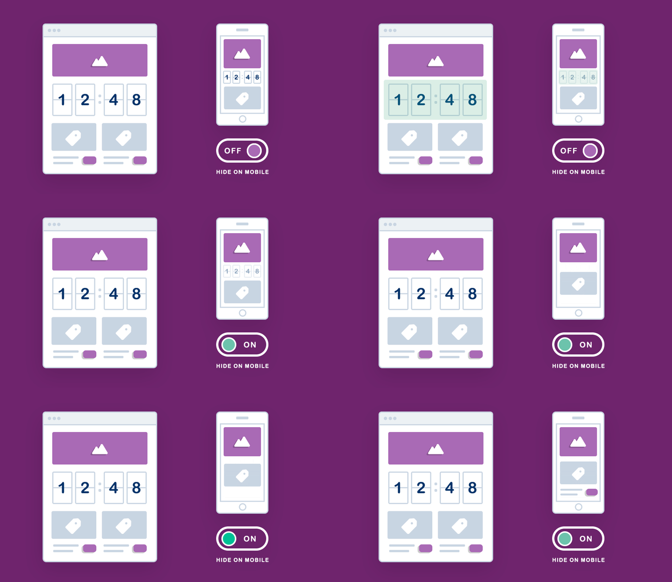
Hide on mobile (or desktop)
Mobile design is not only about the layout responsiveness, but also about having the appropriate content in the right context.
An email that may yield excellent results on desktop screens may not work as well when the user needs to scroll on his mobile device to reach the call to action.
The best way to solve this challenge is to hide unnecessary design and/or content elements when the message displays on mobile devices.
Columns
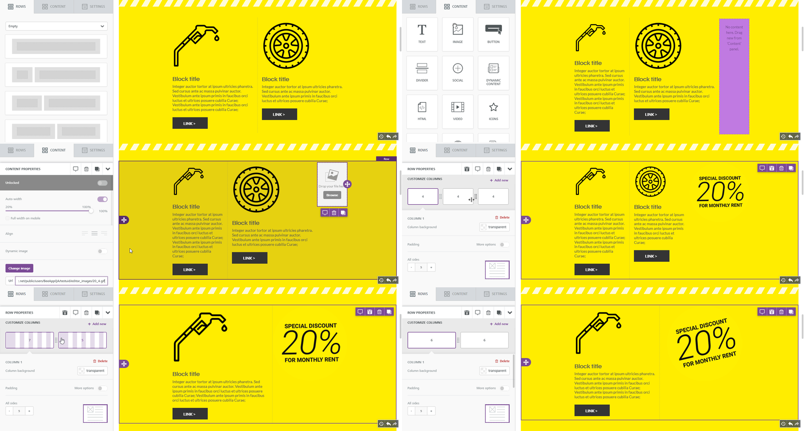
Each row can be separated into columns, allowing you to put different content elements side by side. Each row layout has a maximum of 12 columns and a minimum width of 1. To add a new column, click on + Add new. The new column will be added to the far right side of the row, with a width of 1, and the nearest column on the left will be reduced accordingly.
Flexible Columns
Flexible Columns is located inside the Row properties and allow you to add, resize, and remove columns in real time. Once the row is added to your email, from the side panel, you have the ability to adjust the size of the existing columns by dragging the divider. You can also add or delete the columns from the existing row.
Padding & Borders
You have granular control on padding and borders. You can either set padding or borders around a content element for all sides at once, or individually for each side. This gives you great flexibility in setting the look and feel of your email message.
Content Creation
This section includes a series of tiles that represent the different kinds of content you can use in your message.
| Content Type | Description |
|---|---|
| Title | Allows you to add specific H1/H2/H3 elements to your email design. |
| Paragraph | The Paragraph content block is similar to the Text content block but includes additional formatting options such as Font Weight and Paragraph Spacing. |
| List | Allows you to create numbered or bulleted lists and provides more granular control over list formatting that may have different design requirements than general text. |
| Images |
The file manager is the component that you will use to browse, search, and select the images and documents that you wish to use in your email message. With the handy file manager you can browse, search, and sort existing files, import new files, create folders, and preview and insert images into your message. |
| Buttons | The options allow you to create rounded style or rectangular buttons. Color and padding options are also available. |
| Divider | Dividers allow you to create a visual separation between content. You can control the style of line, size and width. |
| Spacer | Adds an additional space to your email design. |
| Social Icons | You have the ability to choose from a selection of social icons that can work with your design. |
| Dynamic Content* | Dynamic content allows you to use custom rules that display different content to different audiences. The content utilizes the snippet section. |
| HTML | The Custom HTML content block allows you to easily add your own HTML code to an email message that you are designing. It’s as simple to use as a text block. |
| Video | The video content block allows you to easily share you content using just a URL from YouTube or Vimeo. Simply paste the URL into the content block, and the video will be inserted into your content using the cover image for the video with an overlay of the play icon. |
| Icons | Icons allow you to create new layouts mixing icons and images with text without the constrictions of row structures. |
| Menu | Menu allows you to add a simple, text-based navigation element in your email. The properties can be set for each item and the items can be displayed horizontally or vertically by changing the layout. |
Every content block has it owns settings, such as granular control on padding and alignment. The right-side panel automatically switches to a property panel for the selected content element. To use them, just drag one inside a column. It will auto-adjust to the column width.
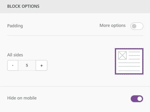
All content blocks in the Drag and Drop editor will also include a new "Hide on mobile" setting in the property panel. To use it, simply scroll down in the right panel until you see the Block Options section, as shown below here.
Custom Attributes
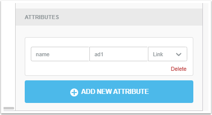
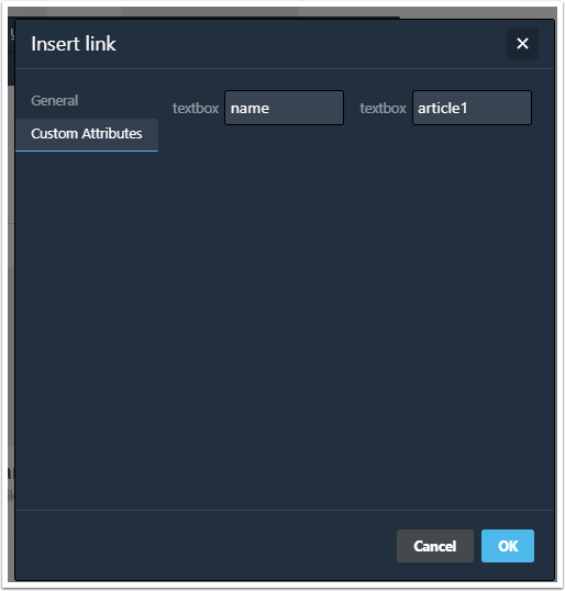
With Custom Attributes, you can easily append additional information to HTML tags in emails. These attributes can be applied to links, both in text blocks and buttons, and images.
For images and buttons, these attributes will be visible in the editor sidebar, under the new Attributes section.
For links in text blocks, they will be part of the dialog window for creating a link.
HTML Block
Using your own code may affect how the message is rendered in email clients, preventing it from adjusting to the screen size (i.e. the "responsiveness" of the message). Make sure to use HTML that is email compliant and responsive.
Allowed tags list:
a, abbr, acronym, address, area, b, bdo, big, blockquote, button, caption, center, cite, code, colgroup, dd, del, dfn, dir, div, dl, dt, em, fieldset, font, form, h1, h2, h3, h4, h5, h6, i, ins, kbd, label, legend, li, map, menu, ol, optgroup, option, p, pre, q, s, samp, select, small, span, strike, strong, sub, sup, table, tbody, td, textarea, tfoot, th, thead, u, tr, tt, u, ul, var
Allowed attributes list:
general attributes: style, id, class, data-*, title a: href, name, target img: align, alt, border height, hspace, src, vspace, width, usemap table: align, bgcolor, border, cellpadding, cellspacing, width tbody: align, valign
Personalization
The Merge Tags option allows you to add database fields to your content to personalize your emails, without needing to manually type in the field's iTL variable. When selected, the border will become solid to signify that it has been selected.
Plain Text
Click Plain Text to create a text version of your email. You can drag and drop your text file into the workspace or autogenerate text based on your HTML by selecting Autogenerate Text in the Content menu.
Spell Check
This feature will identify words in your document that are misspelled. Click on the highlighted word for a list of correctly spelled words to replace it with. Click Save Changes when done.
Mobile Design Mode
Easily toggle between Desktop and Mobile View from the editor. When switched to Mobile View, the editor content area will reduce to 320px. While in Mobile View, you can continue to edit to customize your email design.
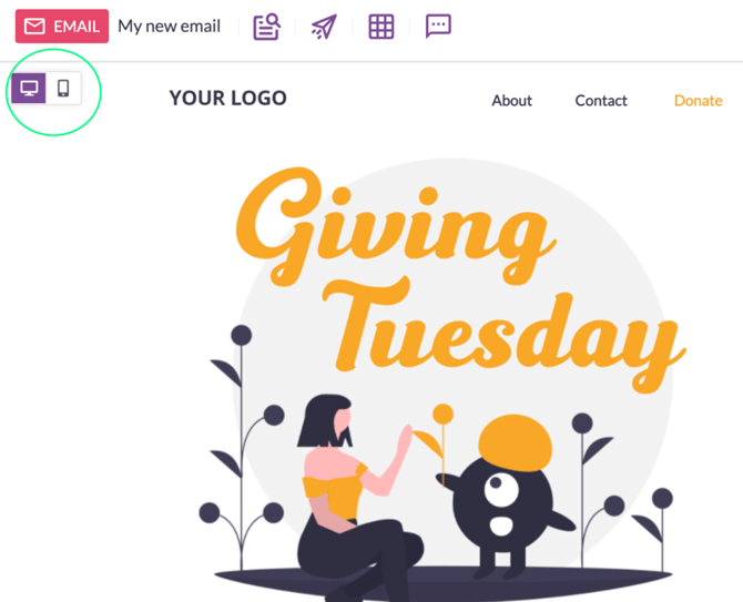
When Mobile View is on, the editor will use a gray backdrop that is not part of the email design.
If you're using the "hide on mobile/desktop" on any content blocks within the email, you will see another icon render next to the design mode toggle. This icon determines whether or not your want content blocks that are hidden on mobile to populate in the editor.
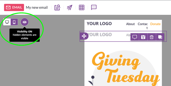
When working in Desktop or Mobile View, any content that is hidden will render as translucent in the editor.
Preview
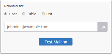
Preview allows you to view how your email will look by device type, along with how the email will appear for a specific contact.
Preview as options:
| Option | Description |
|---|---|
| User | Enter a contact’s address with the desired attributes for which to preview the email and click OK. Note: The contact must be in the system. |
| Table | Click Browse and select the Data Table with the contacts in which you would like to preview the email. At the top of the preview window you can select a specific contact to preview. |
| List | Click Browse and select the List with the contacts in which you would like to preview the email. At the top of the preview window, you can select a specific contact to preview. |
Devices
View how your email will look on Desktop, Mobile and Tablet screens. Click on a tile to see how your email will look on a specific device type.
Inbox Previews
Allows you to preview your email across the most popular clients, apps and devices. To run an inbox preview test, click the Test Preview button.
| Option | Description |
|---|---|
| Client Interfaces | This option allows you to preview how your email will look in the email client’s interface. |
| Blocked Image | This option includes a preview of each client with image blocking enabled (where available). |